NABDIA kiosk
A dual-screen health kiosk with a 2160×3840 curved display over a 1920×540 touch console. Log in, scan your vitals and book a doctor in the working demo.
- Client
- Personal project
- Role
- Design, motion, 3D, front-end
- Format
- 2160×3840 + 1920×540 touch
- Year
- 2026
The brief
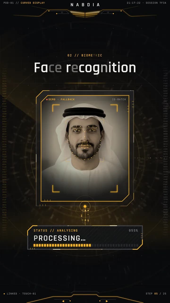
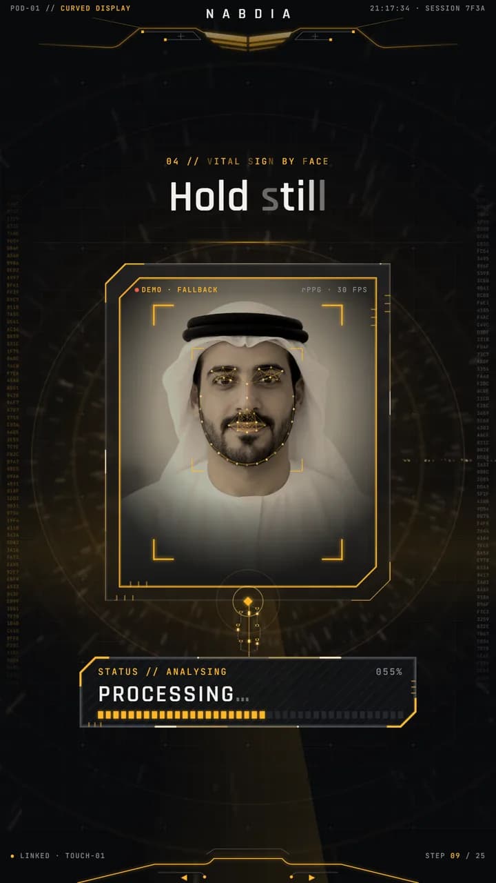
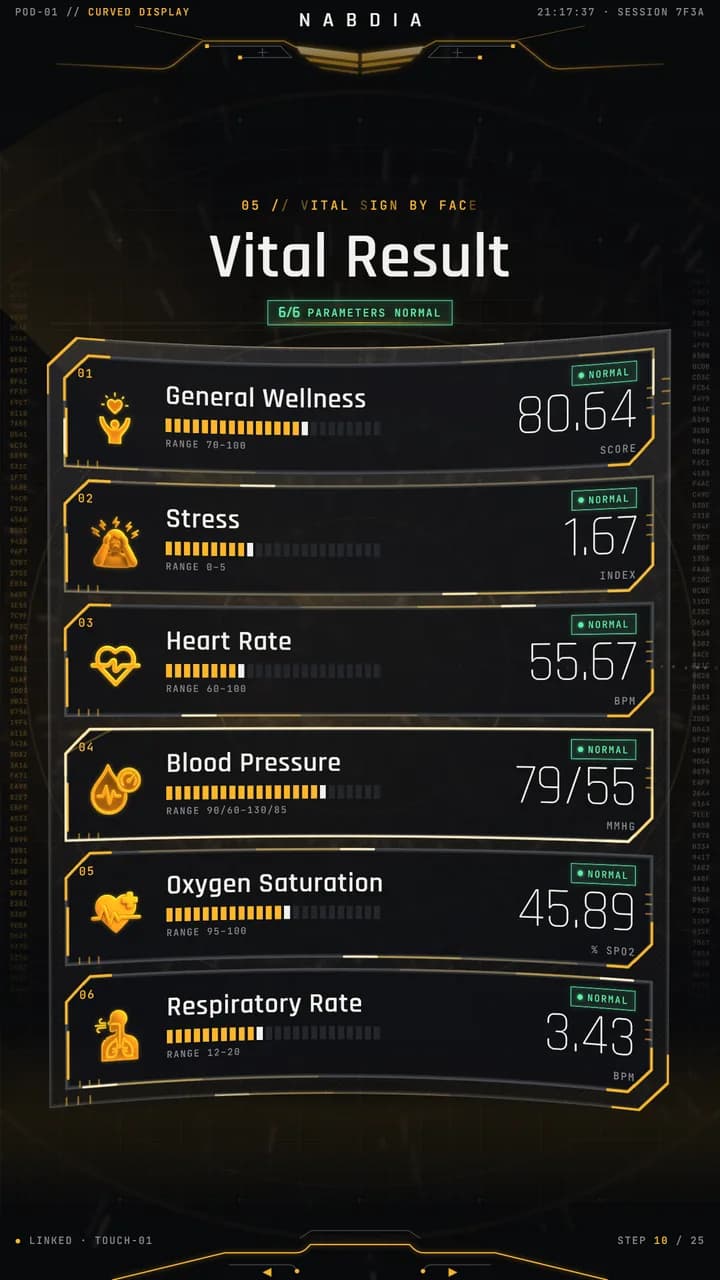
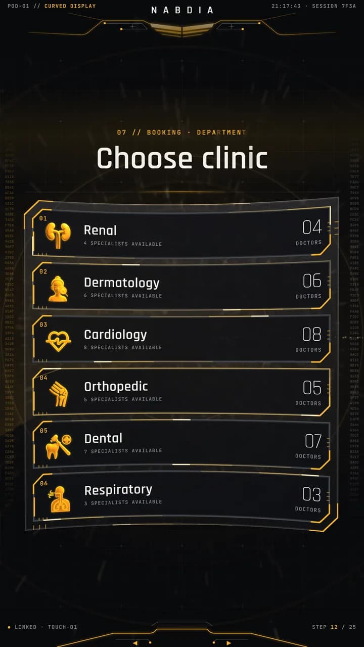
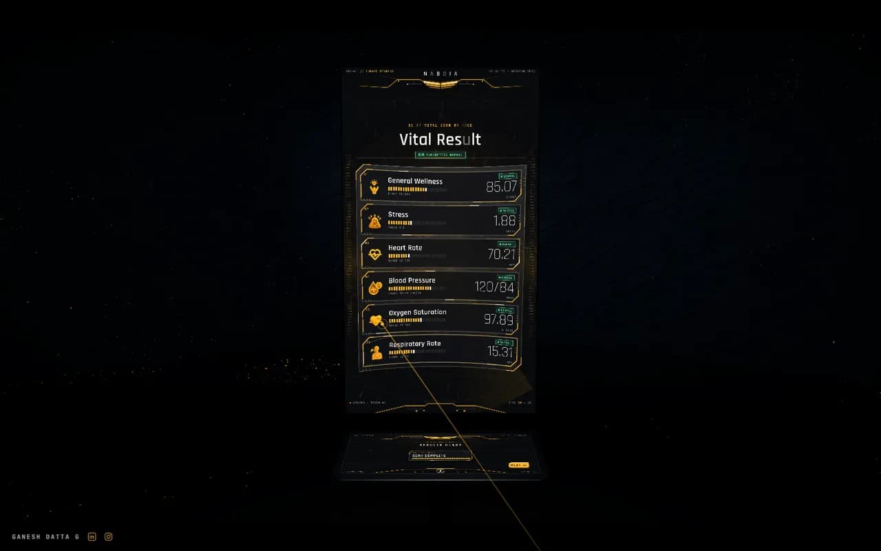
A health kiosk for events and clinics: a tall curved display (2160×3840) above a small touch screen (1920×540). A visitor logs in, has a 15-second face scan for vital signs, books a doctor and gets their results, all standing at one stand.
I rebuilt it as a personal project under a fictional brand, NABDIA, from the motion and UI work I'd done on a real kiosk of this type. Nothing from the original client build is used; every screen, asset and line of code here is new.
The process
I took it from the brief to the running build myself, so nothing was lost between design and code.
- 01BriefTwo screen sizes, one visitor flow, and one rule: improve the look, never shrink the type.
- 02User journeySeven stages from arriving to leaving, mapped across both displays.
- 03StoryboardThe whole journey prototyped in black and white before any styling.
- 04Look and assetsGold on black, hairline frames, icons and the hologram loops.
- 05MotionOne motion grammar for every screen change.
- 06BuildOne HTML file with every screen as data, checked frame by frame by audit scripts.
The visitor journey
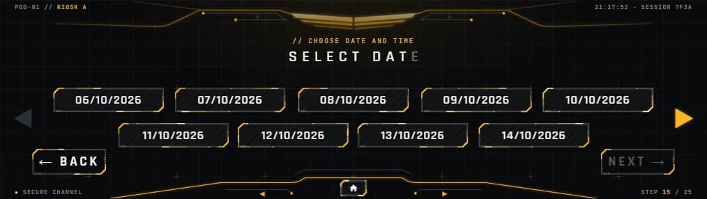
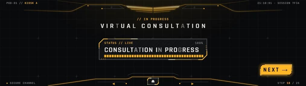
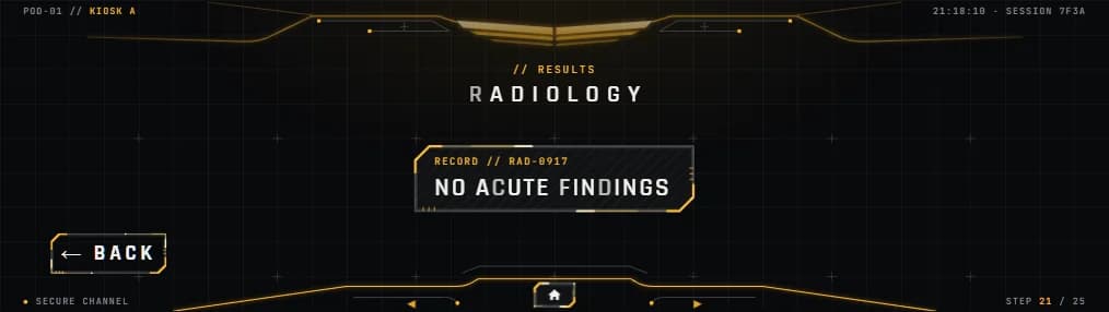
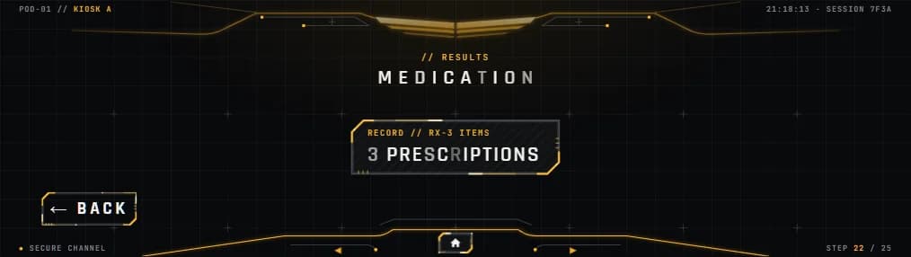
Pick a stage to see both screens as the visitor sees them. The touch console keeps the original layout: the button sizes, type sizes and the single navigation slot were measured and kept.


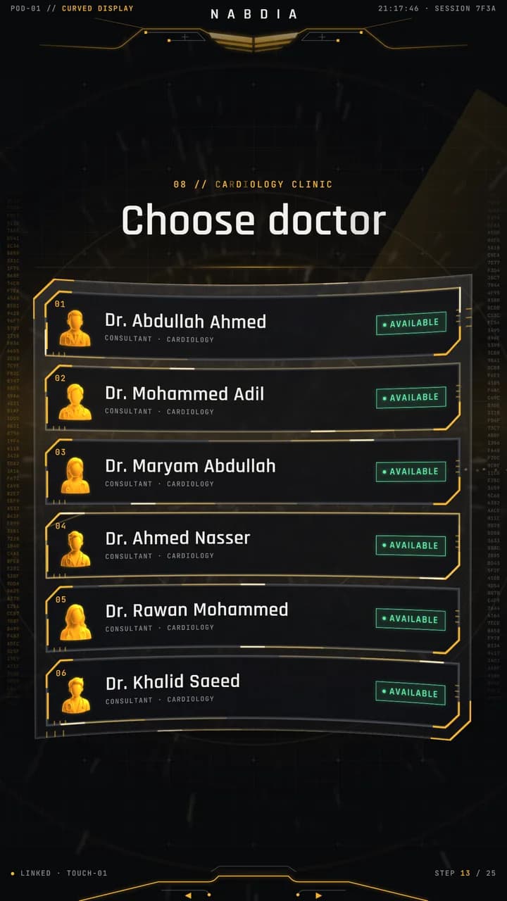

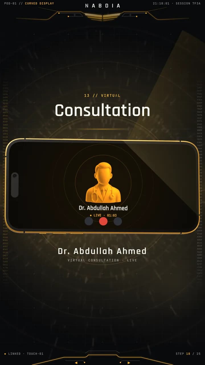
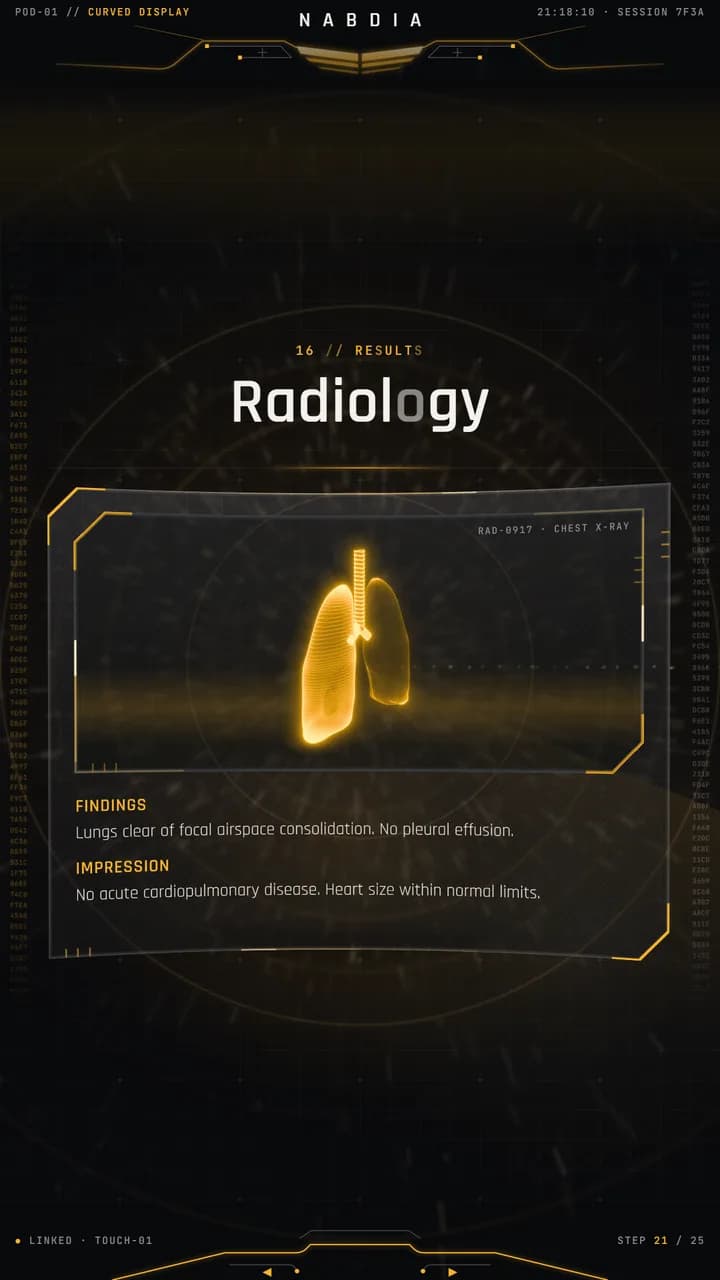
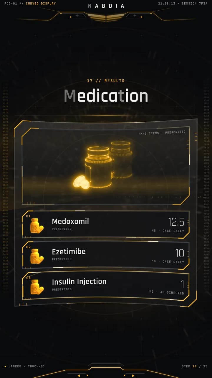
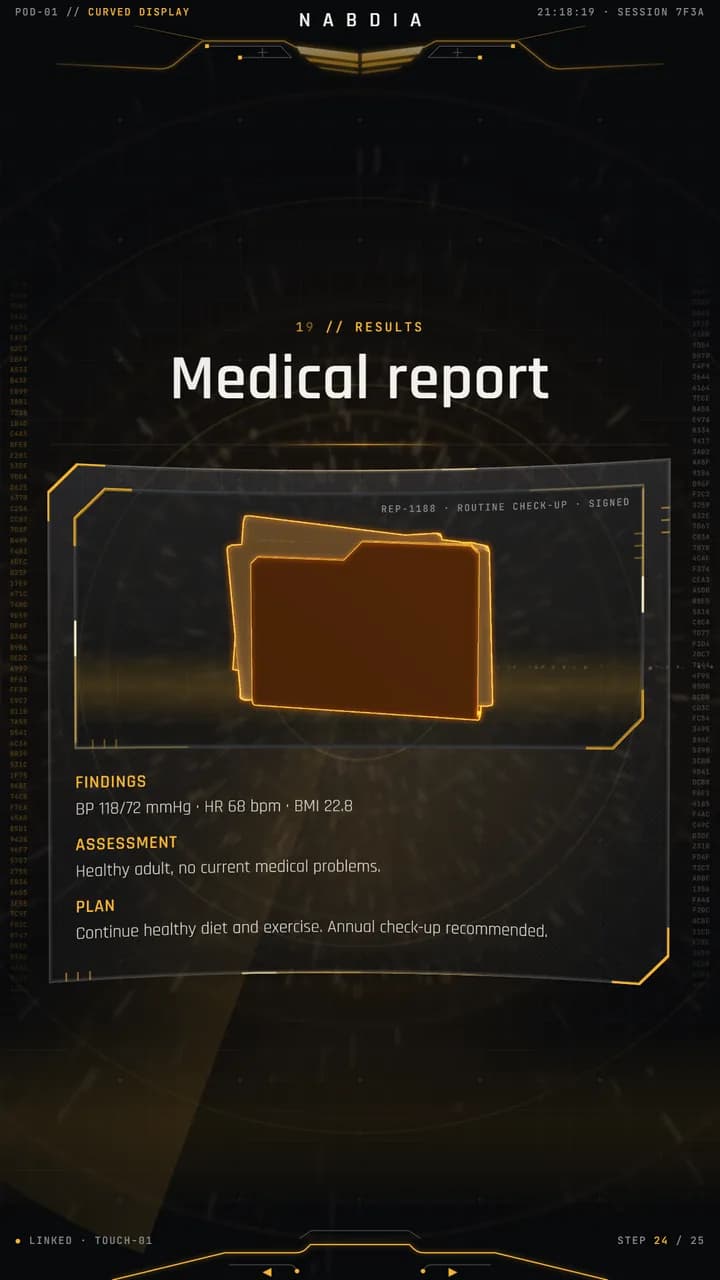
 Main display
Arrive
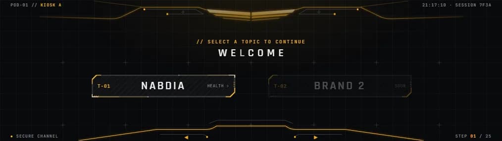
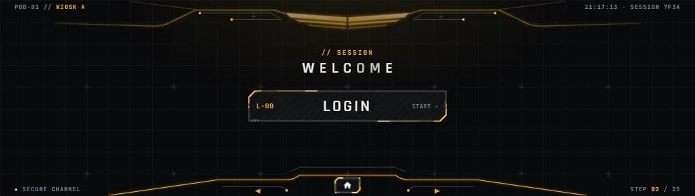
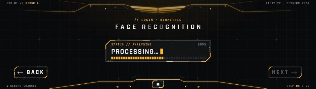
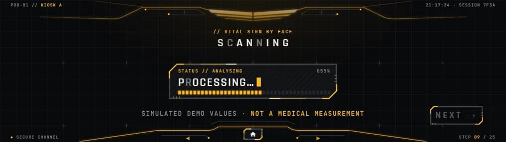
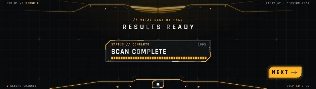
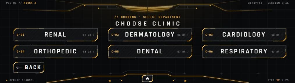
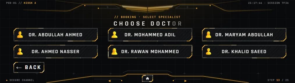
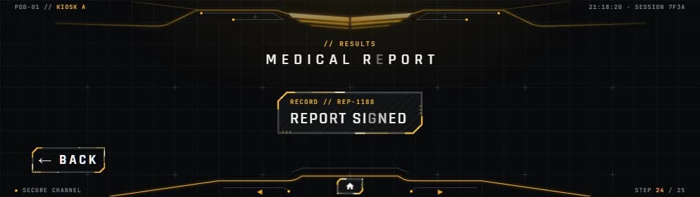
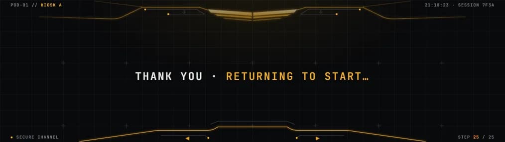 Touch console
Motion and holograms
Every change uses one motion grammar: the background flares into a light-speed burst, the outgoing screen flies up and out, boxes pop open from their centre and text rises in place. The phone and calendar are live three.js; the organ and pill holograms are pre-rendered loops with baked transparency.
The live demo
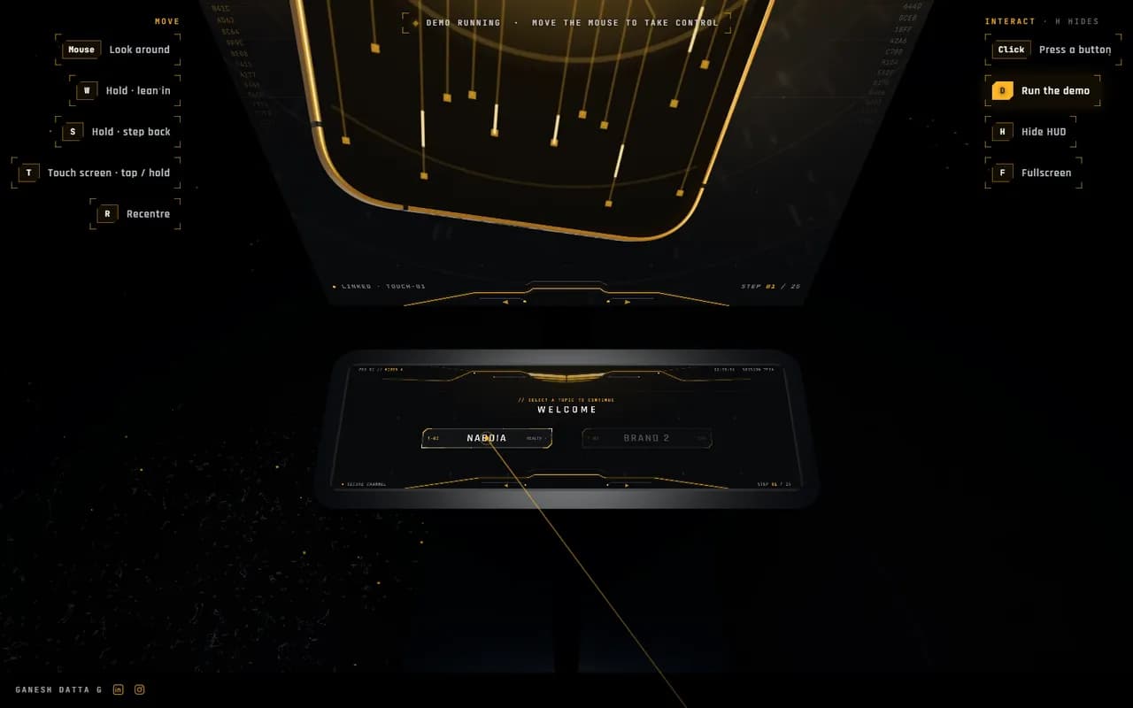
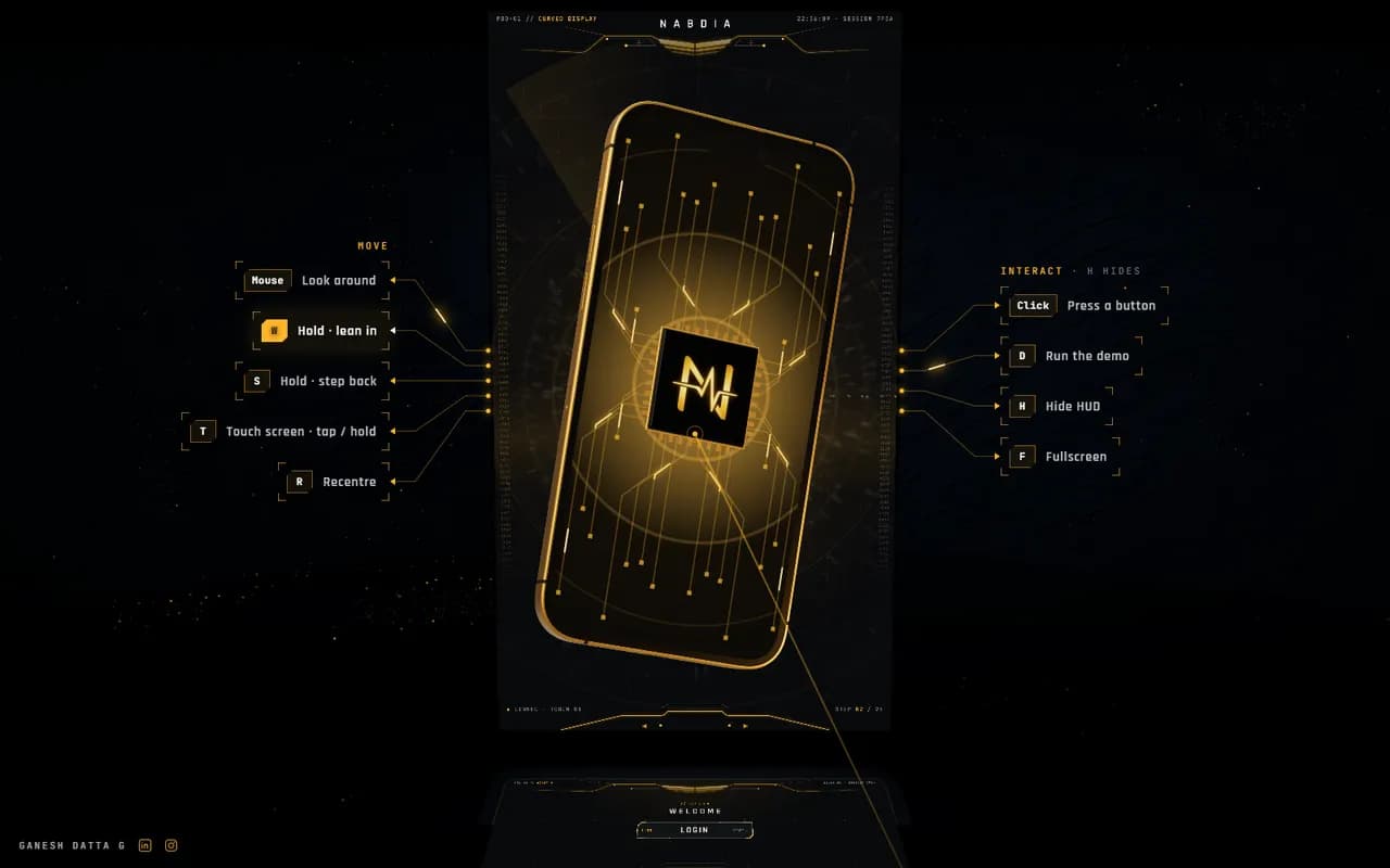
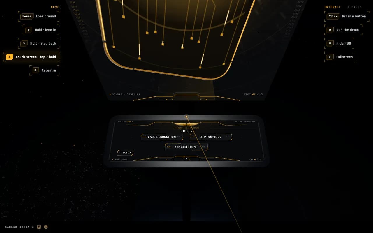
The kiosk runs live on a stand in a dark stone room, so you can use it instead of watching it. Real web pages run on the screens through CSS 3D, so every button you press is the working interface.
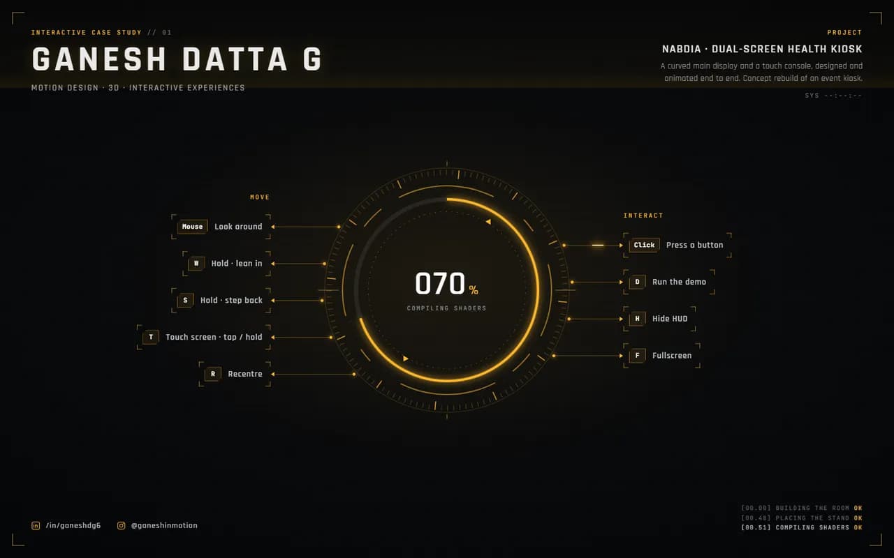
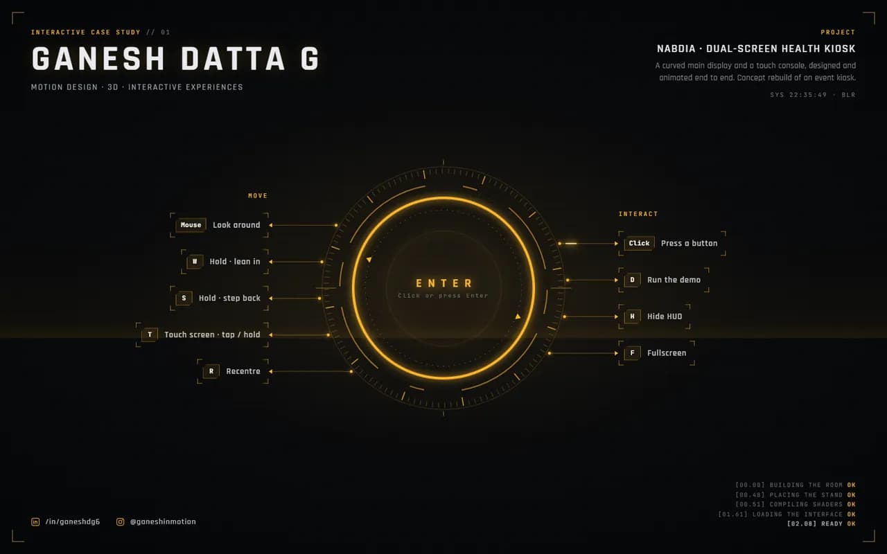
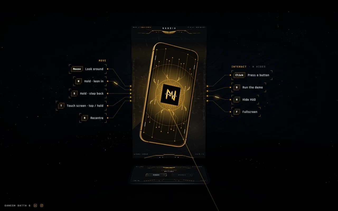
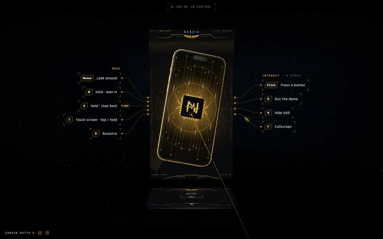
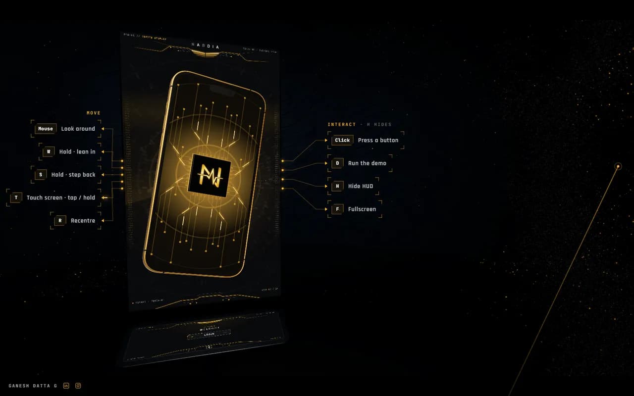
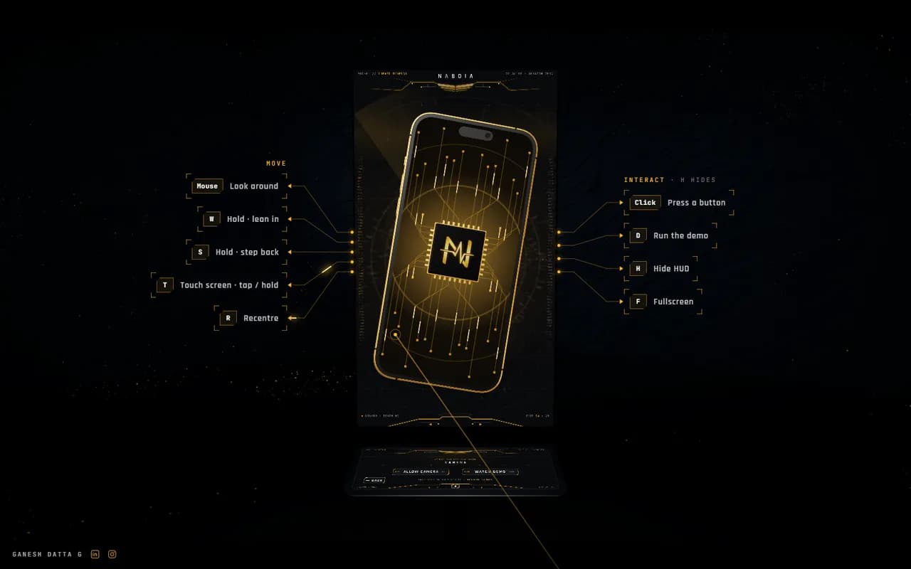
The demo has its own journey: it loads behind a HUD that lays out the controls, walks you up to the stand, runs the kiosk by itself until you move the mouse, then lets you lean in, look down at the console and press through the flow.
The room builds
The reticle fills while the room, the stand and the interface load. The controls are laid out on either side before you go in.
The result
A client can try the kiosk before a single stand is built. The screens render in 7 to 12 ms a frame, the 3D showcase loads in about 2.4 s (down from 6.3 s), and the build is now the template for my next kiosk and multi-screen projects.
Planning a kiosk or a stand?
I design the screens, motion and 3D, then build a working prototype at your real screen sizes, so you can test it before the hardware ships. Tell me where it will run and when.

Got somethingto make?
Open to roles and projects in Singapore, APAC and the GCC